It’s that time of year again, the spooky season is upon us. Whilst frights are perfect for Halloween, they’re not so perfect for your brand identity.
From illegible fonts to colour palettes, the choices that we make may look perfect to us, but can haunt your audience! Our team look at the design decisions that can creep into your brand identity and how to avoid them, not only this Halloween but all year round.
The Cursed Font
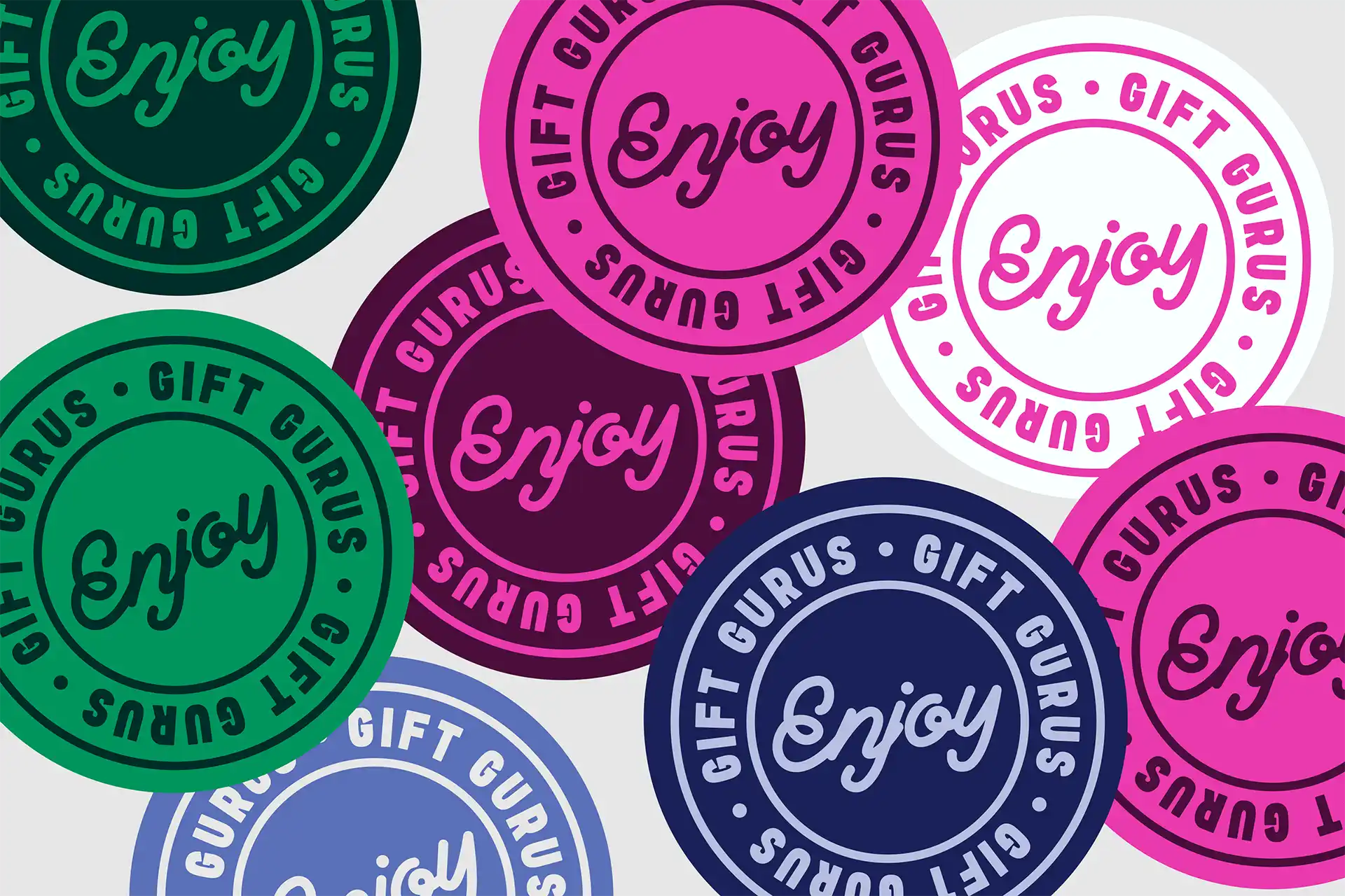
A common nightmare often begins with your font choices. It’s easy to be tempted by a typeface that feels unique or different, something you may believe will set your brand apart from the competition. But what seems stylish at first glance can quickly become a curse.
When your audience struggles to read your message, your brand’s personality gets lost in translation. Our advice? Choose clear, confident typography that communicates effortlessly. Simplicity in type not only makes your brand easier to read but also ensures your message lands every time.
Colour Catastrophe
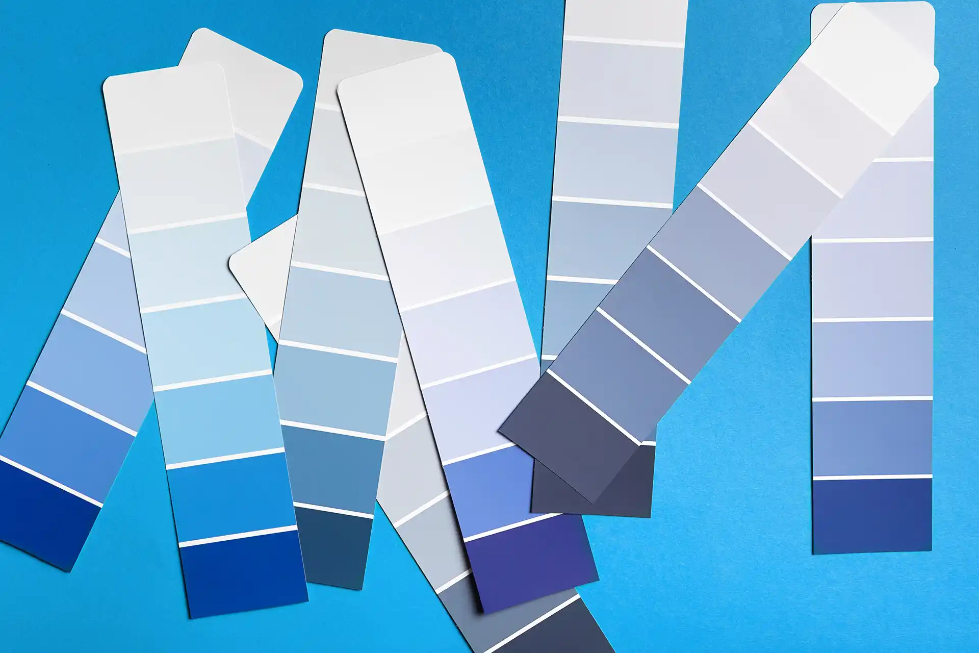
Your colour choice can be a powerful part of your brand. Your choices set the tone of your brand, convey a message, and create instant recognition. But when misused, it can turn from captivating to catastrophic.
A combination of bright, bold hues can clash and compete for attention, creating visual chaos that can cause a headache for your audience. On the other hand, soft or pale tones can fade into the background, leaving your brand looking flat or even forgettable.
Thoughtful colour choices can give your brand life and ensure it stands out for all the right reasons, we’d suggest a combination of the two to not only catch the eye of your target audience but soften your message. A great example of this is our work with Women of the Year, we combined a striking bold yellow softened with a black and white, find out more about our branding work here.
Overcomplicated Effects
Whether it’s glows, shadows, gradients, when applied with care, these effects can add depth and energy to your design. But overdoing them can suffocate your brand, turning your goal of clean communication into visual confusion.
When it comes to your brand, consider whether adding an effect would even benefit your brand; often simplicity is best. For our team, we believe that simplicity can allow your message to breathe and make a far greater impact than layers of unnecessary effects ever could.
If your brand visuals are giving you more chills than thrills, it might be time to call in the professionals to step in. The Strategi Creative team specialise in crafting bold, clear, and memorable brand identities, without the added fright factor! Get in touch with us to see how we can support you with turning your design nightmares into something truly magical.


